Tech Revenue/Profit Sankey Diagrams
— viz — 1 min read
As you know, I'm a fan of nice visualizations and one chart that I don't see enough of (or maybe a chart that is hard to pull off) is a Sankey Diagram. A Sankey diagram is one of those flow diagrams that helps you see parts of a whole. I usually don't think to use these because the use case is so limited, but I saw these diagrams all over social media recently and figured I'd want to highlight how effective they can be!
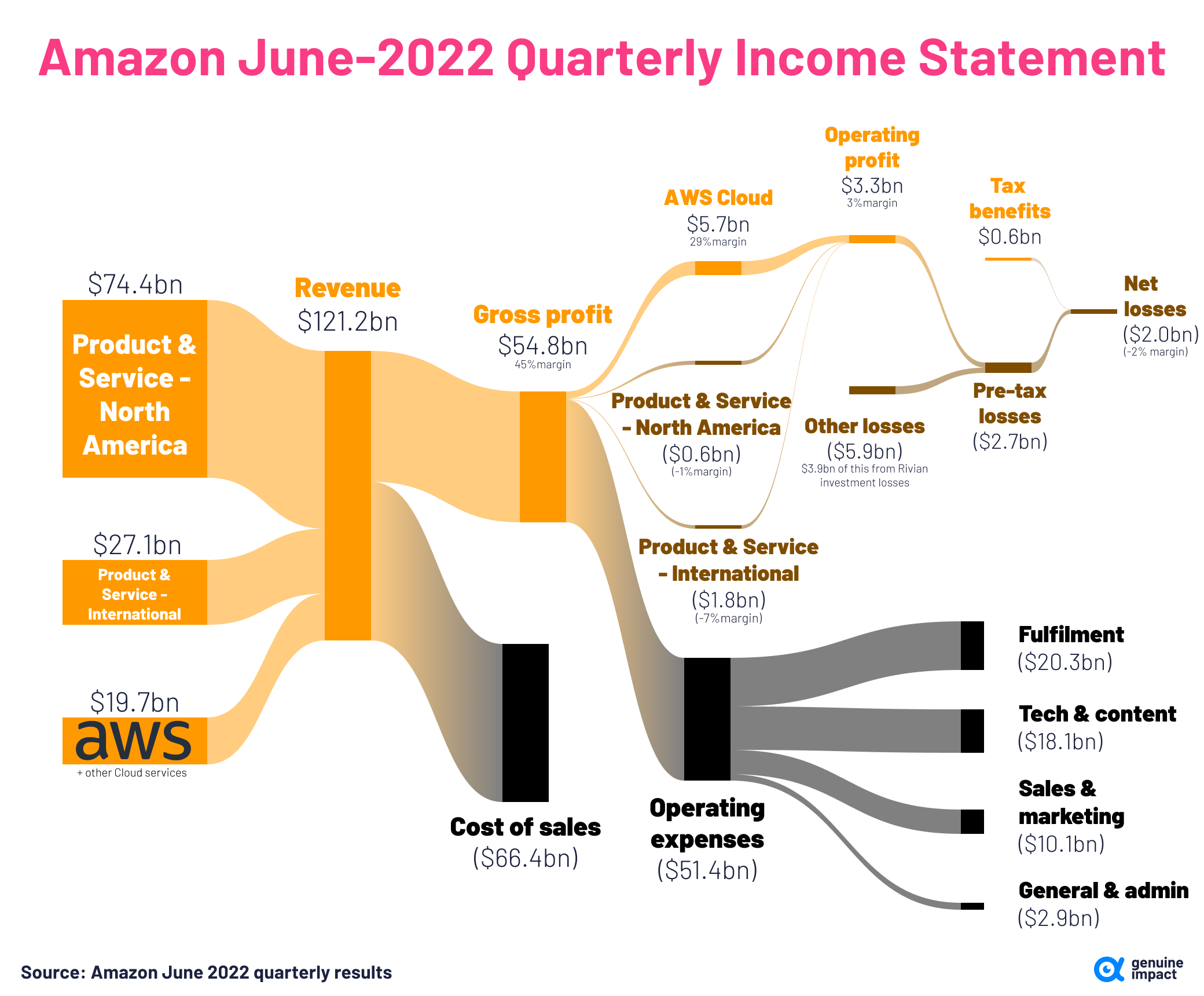
I always had heard that Amazon operates at some level of a loss, but it's quite easy to see how this actually breaks down.
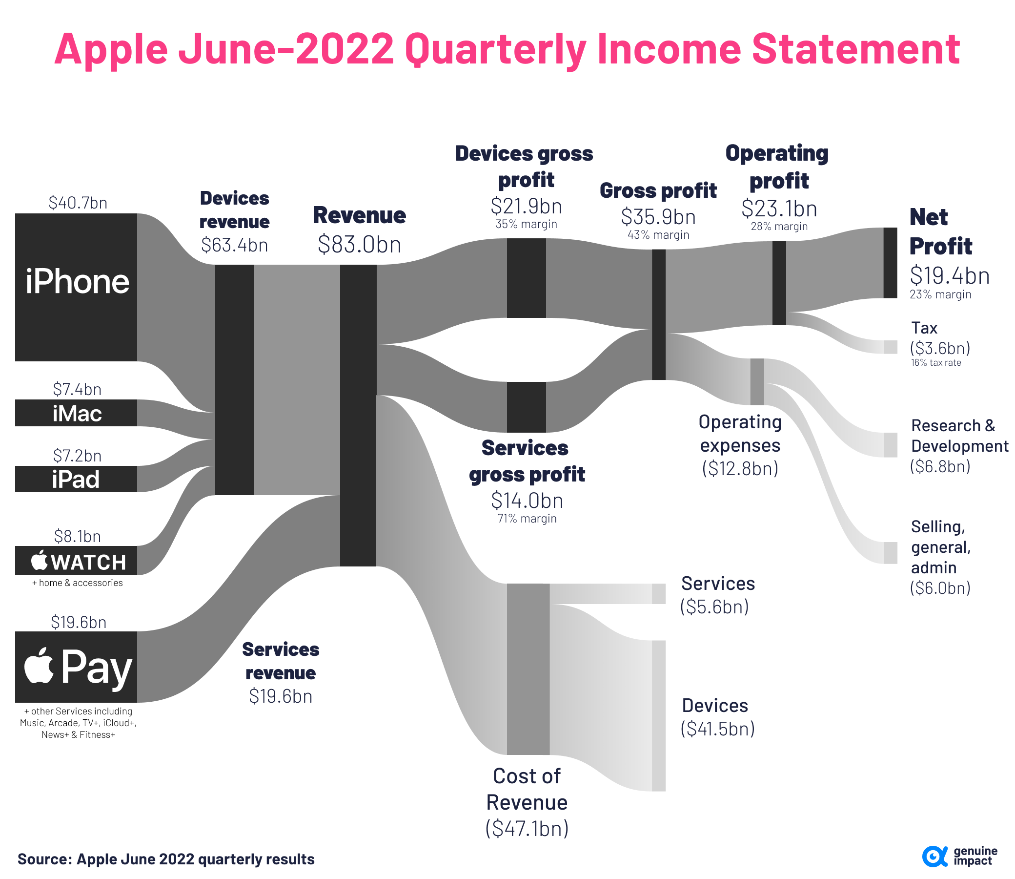
To contrast this, Apple made a staggering 19 billion dollars in profit as reported in the June 2022 quarter results. Unsurprisingly, most of this is driven from the iPhone.
Source: https://www.visualcapitalist.com/cp/big-tech-revenue-profit-by-company/